When designing the ancillary texts (CD cover and advertising poster) we wanted to incorporate the initial idea of using Alice and Roger mixed together, showing their relationship and looking at the Alice in Wonderland’ theme that the music video we had created was based on.

The CD cover was linked very closely to the music video as the front cover had a close up image of Roger standing looking to his right. It is a very simple photo that has been created through us looking at other R&B stars images, performing subtle poses. Roger was edited in black and white, and the background in colour (Purple and Green). Where our background was a sunset we didn’t want to use the obvious sunset colours, so just to add interest we changed our colours, again identifying Alice’s juxtaposed personality. We found that the use of purple, being the colour of good judgement and it is said that if you surround yourself with purple you will have peace of mind. It is also used to calm over activity or energize from depression, which we found worked really well with ‘Alice’s’ depressive state, that’s why she turned too illegal substances. Where purple is the mix of blue (calm, cooling and expansive) and red is (focusing, dynamic and active energy) and the most obvious reason of love, which brings her connection to Roger. Together they portray two different mind states that she undergoes. On the other hand the green comes from the envious state of mind. It also means youthful and vigorous. We felt that it partly showed the connection between life and nature – connecting to her drug addiction. We felt these two significant colours related to both the narrative of the music video and other media references. We went onto changing the colours of the characters eyes as they become the dominant foreground image on the black and white background, standing out hugely. We kept Roger’s eye as blue and changed ‘Alice’s’ eye to green. We again felt this connected with her envious love to Roger. We also felt that having there eyes and half there faces showed that there rocky stage in their relationship where they was never really able to see eye to eye.

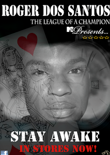
The advertising poster that we have created consists of the a main image of Roger’s faced, merged into a picture of the White Rabbit’s stop watch and a deck of playing cards. We felt that they were two big points in the ‘Alice in Wonderland’ film and were used a lot in our video, connecting with our main idea. We decided to do this for many reasons, such as making the audience aware of the idea for the music video. We also wanted to differentiate the idea of the CD cover and the Digipak, just so if the audience saw one and then the other they would be intrigued at the difference portrayed. We didn’t want to give too much away through the advert that is why we decided to leave Alice out. Where she is the main part of the video, we wanted to give a clue/connection to the theme without adding Alice on there. The ancillary texts that we have created as a group accompany the music video very strongly, setting the scene of a fictional story by introducing the characters and the props. This shows that the texts would appeal to the audience as they could become involved in the fictional world of ‘Alice in Wonderland’ actually feeling like they was part of this story. This means that they could engage thoroughly into this dream world and enjoy the CD and in turn the music video. This means that the ancillary texts create a sense of escapism to the audience which is another uses of gratification that has been used when creating the texts. Overall we feel that we have created very thoroughly thought about ancillary texts, that you can see have had a lot of design time spent on them, which really helps to accompany the music video that we have created. These texts make the audience aware of the music video and album and give them an interest and desire to buy the product. We use the eye contact of ‘Alice’ and ‘Roger’ on the front cover to connect and engage with the audience, drawing them in and making them intrigued to buy the album. I feel the texts use the Uses of Gratifications theory very well, as they give the audience constant information about the album, allowing the target audience to identify with the characters through the use of colour and imagery and they also allow the audience to escape from there everyday lives and become fixated in this dream world of ‘Wonderland’.
The back of cover of the CD we feel creates interest as the background image that is shown relates to the setting of the music video. You see the woods and a tiny figure in the bottom right corner, being Alice. We really liked this image as it sets the scene as a sort of thumbnail for the video. This also shows the continuity between the music video and the ancillary texts as the forest being the home of ‘The rabbit home’ equalling ‘Wonderland’. We kept the colour scheme the same on the back half as the front, having the image in colour and just the grass in black and white. Where we introduced the singer on the front cover of the CD, we felt on the back we should just have ‘Alice’ and her connection with ‘Wonderland’ as an overview of the storyline. We added in a quote ‘You never know how strong you are, till being strong is your only option’ we really liked this and felt it would be nice to have a quote on the back page, said by the artist. We felt this really showed his emotional side, and considering one of the shots on the front is of Roger looking emotional, it worked really well.

The advertising poster that we have created consists of the a main image of Roger’s faced, merged into a picture of the White Rabbit’s stop watch and a deck of playing cards. We felt that they were two big points in the ‘Alice in Wonderland’ film and were used a lot in our video, connecting with our main idea. We decided to do this for many reasons, such as making the audience aware of the idea for the music video. We also wanted to differentiate the idea of the CD cover and the Digipak, just so if the audience saw one and then the other they would be intrigued at the difference portrayed. We didn’t want to give too much away through the advert that is why we decided to leave Alice out. Where she is the main part of the video, we wanted to give a clue/connection to the theme without adding Alice on there. The ancillary texts that we have created as a group accompany the music video very strongly, setting the scene of a fictional story by introducing the characters and the props. This shows that the texts would appeal to the audience as they could become involved in the fictional world of ‘Alice in Wonderland’ actually feeling like they was part of this story. This means that they could engage thoroughly into this dream world and enjoy the CD and in turn the music video. This means that the ancillary texts create a sense of escapism to the audience which is another uses of gratification that has been used when creating the texts. Overall we feel that we have created very thoroughly thought about ancillary texts, that you can see have had a lot of design time spent on them, which really helps to accompany the music video that we have created. These texts make the audience aware of the music video and album and give them an interest and desire to buy the product. We use the eye contact of ‘Alice’ and ‘Roger’ on the front cover to connect and engage with the audience, drawing them in and making them intrigued to buy the album. I feel the texts use the Uses of Gratifications theory very well, as they give the audience constant information about the album, allowing the target audience to identify with the characters through the use of colour and imagery and they also allow the audience to escape from there everyday lives and become fixated in this dream world of ‘Wonderland’.
No comments:
Post a Comment