 For my Digipak analysis I have chosen two completely different Album Cover's, too show the contrast and difference that two different genre styles and music can have. When you look at this album cover by 'Heavy Metal, Metalcore' band you can see straight away the use of what looks like intestines/insides, covered in blood. This automatically creates a link too the style of music being very 'deep' and heavy. The contrast of the colour with the black and white, really make the red blood stand out, making it the important factor in the picture, completely overwriting the woman figure in the image. The name of the band and the name of the album, has been written in a bold style writing, which is a transparent style, this again makes the blood stand out more. The point of the woman holding the blood, is because many of 'Bring Me The Horizon's' songs are very related too blood, and death. The womanly figure looks very gormless and fixated, with her eyes wide open looking straight at you, it actually makes you feel like she is staring at you, which is another way of them too yield the buyers into buying the album as the focus really stands out. She is dressed in black which is for the contrast of the blood, and showing her as a simple figure.
Bombay Bicycle Club - Flaws

Front Cover
Back Cover
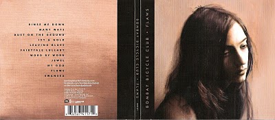
When looking at this digipak, you can see straight away the faded, subtle, vintage colour scheme. It is very neutral with the skin toned, pastel coloured pinks and blues. The layout design is very simplistic, with the painted style background with the brush strokes quite obviously painted on. The font of the text is again minimalistic, just a simple san serif type and it is only ever in either black or white, which helps it stand out. It's a type writer style writing, that's very unique and again obtains a vintage effect. The minimalistic style of the cover, font and colour scheme, relates too their folk style of music, this again could be how the band want to be perceived, simple, basic and meaningful. The mise-en-scene shown is once again very simple, there is not much going on, but the main focus of the images on the front and inside. Both of the shown images are paintings of humans, the front cover's main image, is simply of a girl looking down. She doesn't look particularly grabbing or smiling, but less dull and bleak. This portrays the mood and vibe of the c.d, if an image of a lady happy and smiling was the album cover, it would give the wrong impression of the c.d. The image shown inside is of somebody kneeling, with the focus on their feet. This picture has alot of mystery as you don't know the story behind it. I think that both paintings suggest the relaxed, down to earth nature of the music. The back and inside contain all the designated information needed, such as barcode and record company logo.
No comments:
Post a Comment